января 2022
Pierluigi Masini
THE ETERNAL CONTEMPORARY
I have always thought of interior design by Edra as of something extremely innovative yet classical. Now that I am writing about it, I wonder: can one be really innovative and classical at the same time? This sounds like an oxymoron. Innovation moves one way: it is fast, user-friendly, even aggressive in its timing, disruptive. Classicism rests on different grounds, it needs to salvage the vestiges of ancient memories, to put together deeply assimilated forms and suggestions that belong to us, to our culture. They belong to our inner landscape, made of shapes and sizes that we unconsciously carry within ourselves. And by definition, a classic is timeless: this is another factor that Edra puts into its view of interior design. It proposes that its products will be passed down the generations: just the opposite of what design has always supported, what with the rituals of the latest from the Salone del Mobile, the collections that move at a pace with fashion, and so on and so forth. But I’ll come back to this.
Now, I want to go back to my personal feelings about some sofas and armchairs that, years later, many years later, decades actually, still arouse emotions and thoughts in me. I am thinking that this Magazine, a new adventure that makes Edra a brave print publisher as well, is the right training ground to practise and share certain musings.
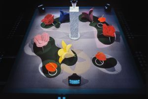
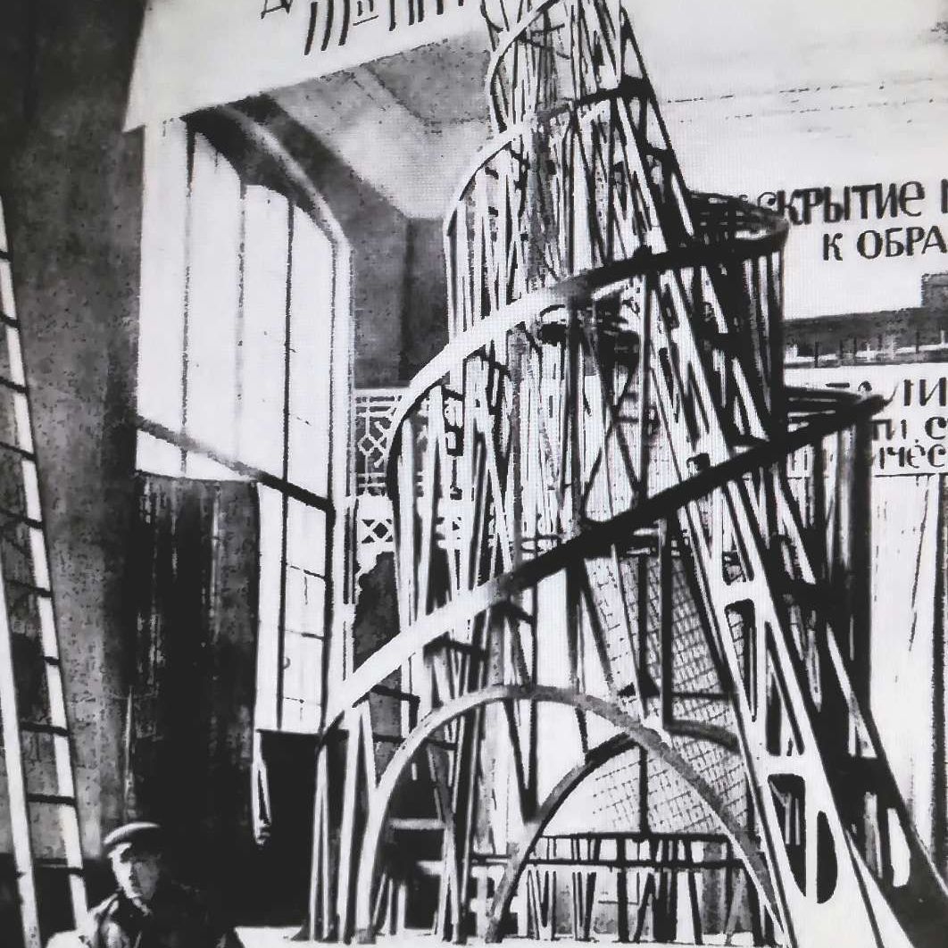
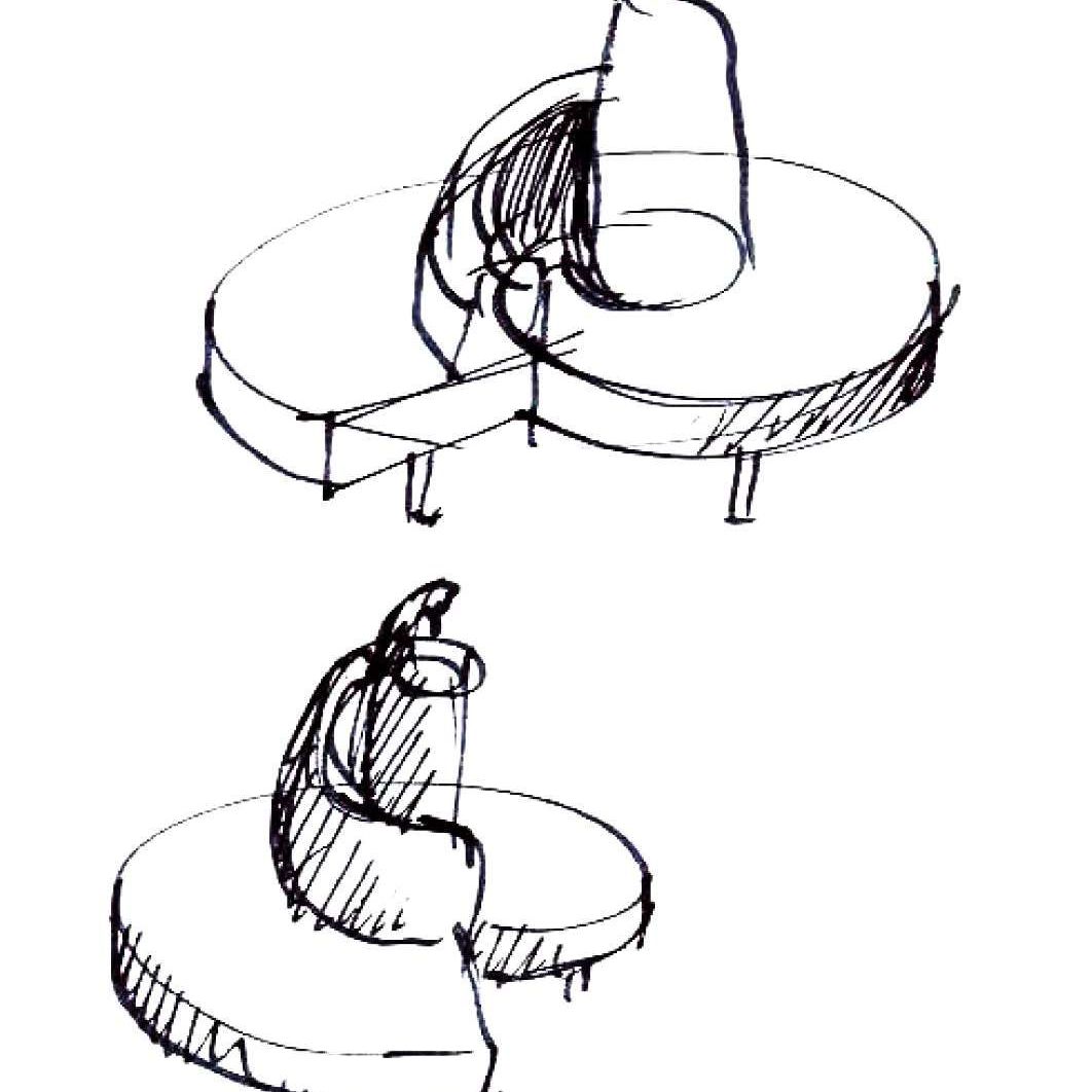
I would like to make a first example that I think may help explain what I mean. Let’s start with the Tatlin, a sofa born of Mario Cananzi’s and Roberto Semprini’s pen over thirty years ago, 1988 for the record. Vladimir Tatlin was the father of Russian Constructivism, he loved Picasso and the Futurists, whom he had met in Paris, and just over a century ago he designed the Monument to the Third International, which had to be four hundred metres tall and cast a shadow on the Winter Palace, the tsars’ residence in St Petersburg.
CAN ONE BE REALLY INNOVATIVE AND CLASSICAL AT THE SAME TIME? THIS SOUNDS LIKE AN OXYMORON
Needless to say, the project fell through. A huge scale model was all that was left, an example of architecture that was unattainable until, in the early days of its life, Edra decided to produce that sofa that became an overnight icon: it is round, it must be placed in the midst of a room, its soft velvet pinnacle is barely one and a half metre tall but it feels like sitting on a piece of architecture, it feels like being the centre of attention, like standing all over the place. It is something to do with the design and the sculpture, a soft sculpture. It is a subtle pleasure, that of the Tatlin, that, so many years later, it still affords you. How can that be achieved?
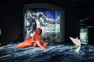
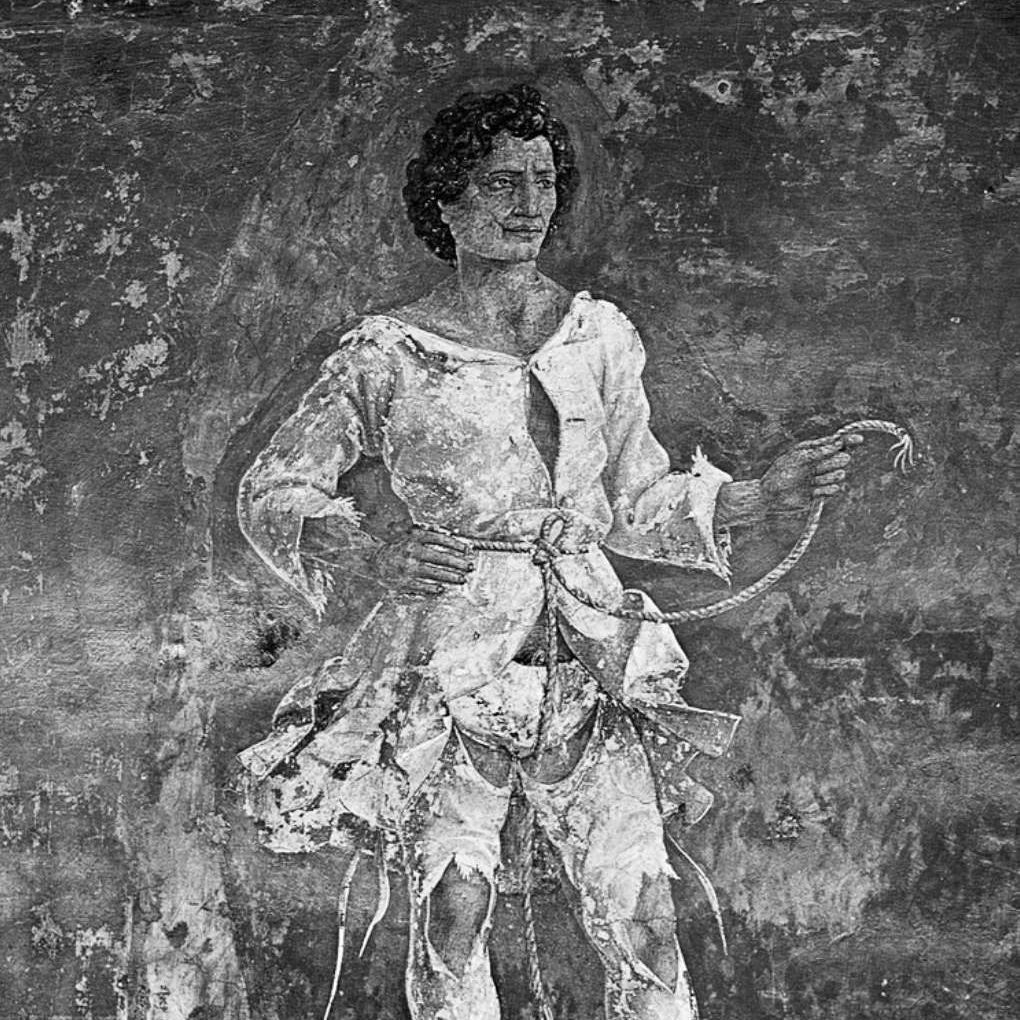
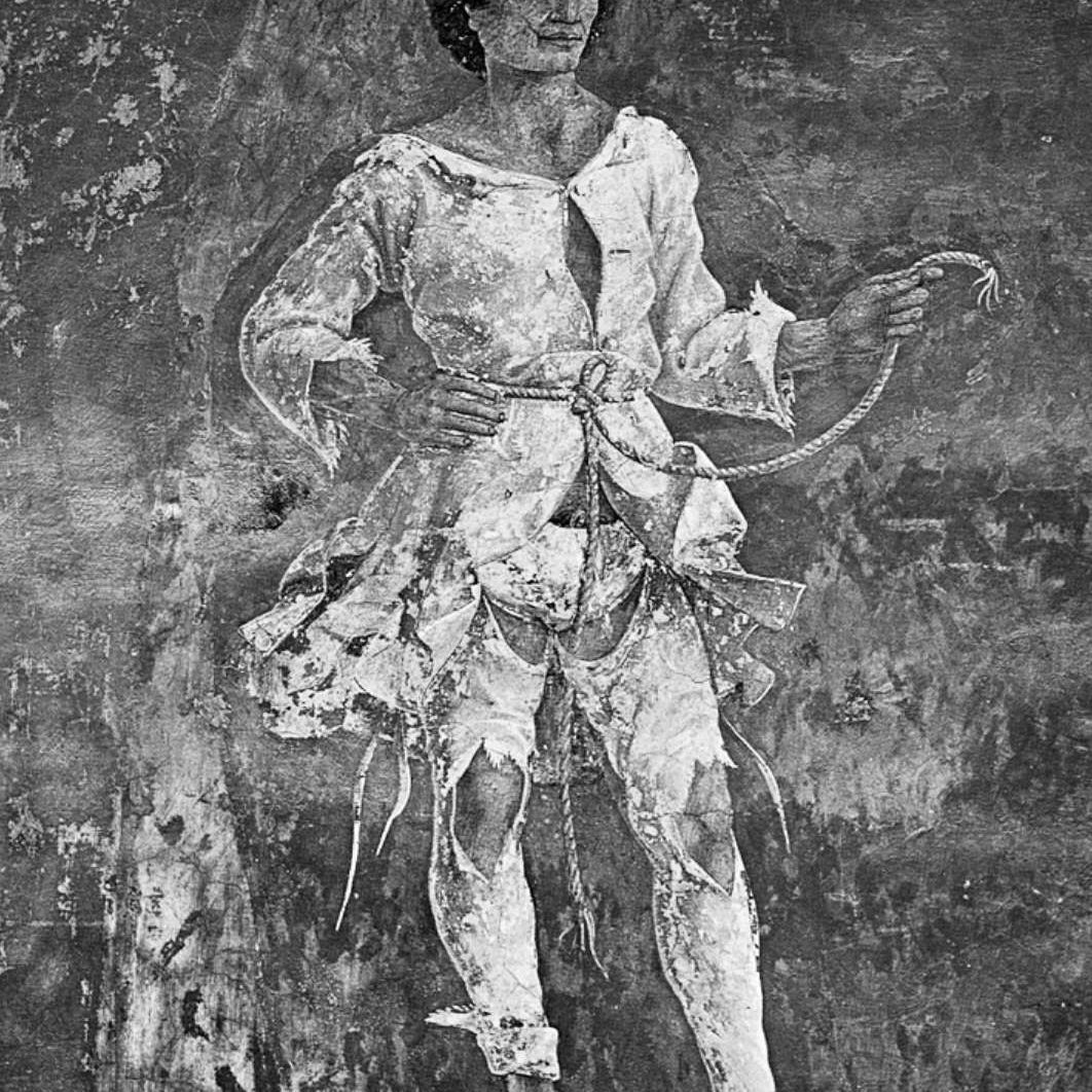
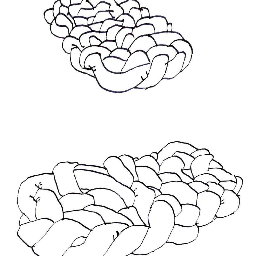
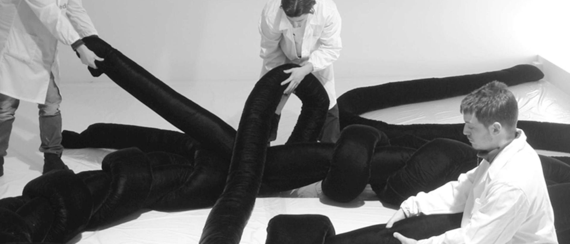
I will make another example, the Boa by Fernando and Humberto Campana. How would you call that? I couldn’t find a word: of course, you sit on it, but a sofa made of one hundred and twenty metres of tubes entwined together for days is something that has never been seen before. A velvety frame to sit on, every time in a different way. It reminds me of the charms of knots: those that around the year 1000 the Byzantines used to engrave in marble and that the Irish amanuenses handwrote in their codices. The knots that Leonardo left on the ceiling of the Sala delle Asse, in the Sforza Castle in Milan. The knot that hangs from the belt of the Vir Niger, painted by Francesco del Cossa and a young Cosmé Tura in Palazzo Schifanoia in Ferrara, a mysterious character studied by Aby Warburg.
TRULY MODERN IS WHAT IS WORTH BECOMING ANCIENT…MODERN IS THE SPIRIT OF THE TIMES, BUT TRUE FORM CANNOT BUT BE CLASSICAL -
DINO GAVINA
Of course, even the knots of a people, the Brazilians, who know how to bring their crafts to the highest levels from scratch. There’s a world of inspirations in a knot. And nobody had ever turned that knot into a sofa before: a knot of love, of conspiratorial alliance, a knot that ties stories and tales, lures, memories together.
“Truly modern is what is worth becoming ancient … modern is the spirit of the times, but true form cannot but be classical”. I have often thought of this sentence by Dino Gavina: he loved to repeat it, and I remember he said it the last time I met him in his memorial house in Bologna. It’s a beautiful sentence, a begetter of thoughts, prescient in its own way: the modern and the ancient, the classicism of form, the sense of contemporariness and its evolution, the legacy of what we are and that we must leave to those who will come after us.
EDRA GAMBLES ON MODERNITY AND SO IT STAKES A CLAIM ON ITS ROLE AS BECOMING ANCIENT, ONE DAY. AND THERE'S MORE THAN THAT
Contemporariness is the dimension that the interior design market has always moved within: isn’t this the background where Italian design was born on? Hasn’t it grown as opposed to the models of the past? Wasn’t it supposed to gain ground and thrive over what had existed for centuries? It wasn’t art, it wasn’t (just) craftsmanship, and it found its strength on the spur of such Futurists as Balla and Depero, revolutionary fervour as opposed to the ‘stick-in-the-mud’ attitude of those reproduction rooms that revamp the Rococo scrolls and lion’s paws. Three things stood out in this drive to update the furniture. Firstly, the rationale of industrial design, i.e. serial production through new processes and machines as well as unprecedented materials. Then, the need to push for products that might express contemporariness, a tricky, elusive, undecipherable ground, because it is something that happens with us. The third point, which is connected to that, is their being intrinsically ephemeral, bound to be quickly replaced, fashionable items to be displayed at a show to collect orders and then forgotten about next year. All the more so, thinking that one day those pieces would have doubled up in value instead of ending up in a landfill was a gamble. Edra gambles on modernity and so it stakes a claim on its role as becoming ancient, one day. And there’s more than that.
Italian design has always been a dream more than a need. It is a combination of one thousands different experiments, one after the other. It is the redeeming result of a multitude of failures. It has never had the unshakeable confidence in the industry of the Germans or the barnstorming faith in socialist design of the Nordic countries. It followed trends, with their rituals and their collections, and all the while legitimating the present, centimetre after centimetre. It had to please a fickle clientele and embody a phenomenal status symbol, set in the most intimate temple of everyday life: the home.
Really modern in the 60s and 70s was thermoplastic and fibreglass furniture, its space-like shapes heralding a ‘Moonbase Alpha’ future. But, let’s be honest, the concept of permanence did not exist yet. Businessmen did not want it, as they were running after the new at all costs, nor did designers, who rightly followed hot on their heels. Nobody wanted the lifecycle of such products to be long, quite the opposite: people had fly-by-night dreams that turned into urgent needs, and then even more dreams. And they were all busy producing. Just think of what happened in the years of the Yuppies, of Reaganomics, when the Italy ‘of doing’ viewed a product performance that outlasted the minimum required time (for the price paid) as a seriously defective design. That’s why nowadays, even if they have been mass produced, so many designer items that have survived the test of time are listed for very high prices in specialist galleries: there are just a few left, they are the survivors of a hodgepodge generation, the undertow of the big binge that is handed down to us with the patina of time.
Therefore, the concept that a nice piece of furniture or an armchair would have to last did not exist back then. Yet, it is something that raises the bar of customer satisfaction. In Manichean terms, value is ‘good’ and pleasure is ‘evil’. But, in terms of marketing, instead, value and pleasure have always been the golden rule of success. But the world of luxury, from fashion to cars, hardly ever espouses the value of permanence, the tendency of an object to withstand the test of time. And, when it does, it rightly shrouds it in the brand’s heritage, in its legacy of expertise: if you think about that, the Swiss watch to be passed down from father to son is the promise of an unexpected afterlife on earth and spins a dedicated story, which, in aspirational terms, powerfully increase its perceived value.
Edra’s concept of building products made to last is something new in the history of interior design. I find it is unique, distinctive, a sound and important promise. Someone who sets such ambitious goals for themselves, by aiming for such an asset as heritability, sparks off a timeless effect that brings along other pleasant consequences too. Firstly, the perceived message is that, by doing that, one will cross the threshold of the present, the favourite hunting ground of design studios and of the most predictable marketing: in the projection about the future, the past and the present live together while outliving time. And they cannot do it, unless the value of the product itself, its lifecycle, is really out of the ordinary. So, research into materials becomes consistent in terms of enduring wellbeing, which is another feature Edra has built its offering on. In addition, the new clientele increasingly values things that are made to last, that spend time with us and that are part of our lives, not just of our homes. The opposite of what the market was looking for, in the Seventies.
The second consequence is that the ‘breaking news’ attitude, the trends and fashions, are being shelved to embrace classicism. Something that identifies a company, that is updated at a slow pace, that is strong and sound. The concept of classic: we Italians cannot live without the concept of classic because we are surrounded by it, so overwhelmed we barely notice. We live the tradition, the elegance and sophistication of our cities, of our villages and of our landscape, yet we love innovation, we always have. This is another one of our distinctive features. A modern soul and a classical shape.
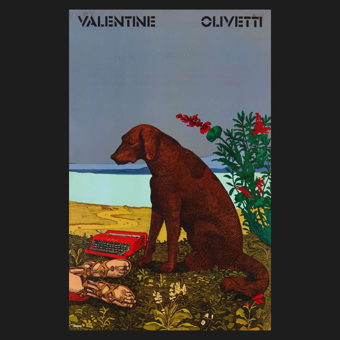
The classical, and therefore the anti-classical, is like a subterranean river, and sometimes it comes to the surface. Let’s think of what Milton Glaser, the graphic designer of I love NY (written with a red heart) did, when in 1969 Olivetti commissioned him to create a poster for the Valentine, the red typewriter designed by Ettore Sottsass. He went to the London National Gallery and took a 1495 painting by Piero di Cosimo, The Death of Procris, inspired by Ovid’s Metamorphoses, and put her, the Valentine, next to the detail of the dog who sits up besides his dead owner. The peak of classicism and the peak of innovation: modernity storming into the classical past.
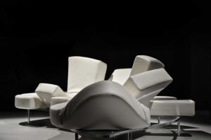
And then we could mention the well-known Milo by Carlo Mollino, that lets us reflect ourselves in the silhouette of the famous Venus. Showing the heritage of Classicism yet apparently scoffing at it.
Classical does not have to mean copying old forms and stylistic devices. Should we think of waiting decades before one of today’s interior design projects is proclaimed a classic? The elegance of proportions, along with the sophistication of the materials, is a classical theme that does not need to wait decades to become recognisable in its own right. And the ‘one-size-fits-all’ marketing of the 80s that proclaimed the success of the happy few has new drivers now: obsolescence is valueless, tradition and class are valuable.
In the world of contemporary interior design, classicism is a project that quickly earns its own aura. I find that the comments made by Domitilla Dardi and Vanni Pasca in their recent Manuale di Storia del Design are right on the mark when they include the Campana Brothers’ pieces in the list of anti-classical products: right, that’s the way they were born, both the Boa and the Favela or the Corallo have been inspired by something else. Brazil combines Lina Bo Bardi’s legacy with that of the artisans of poverty, a million miles away from Piero della Francesca’s invention of perspective.
But, if you think about it, that powerful innovative drive soon turned the Campana Brothers’ pieces into classic designer items, nothing short of icons. And, by definition, a classic defies time.
 |
Pierluigi Masini A professional journalist, with a degree in Italian literature and a specialisation in Art History, two master’s degrees in Marketing and Communication, he teaches Design History at Raffles Milano and Interior Design and Sustainability at YACademy. He is the author of a book about Gabriella Crespi. |


